

SIJE CI Renewal Story (3): Extending the Formula into Type and Graphics
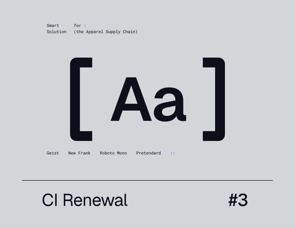
Part 1 covered the logo and Part 2 covered color.
But even with the logo and colors set, what people see most is text. Proposals, slides, business cards and web pages are all filled with words. And the graphics that organize that text are what let people recognize SIJE in any material.
In Part 3, we lay out SIJE’s typeface system and graphic motifs.
Typefaces Divided by Role
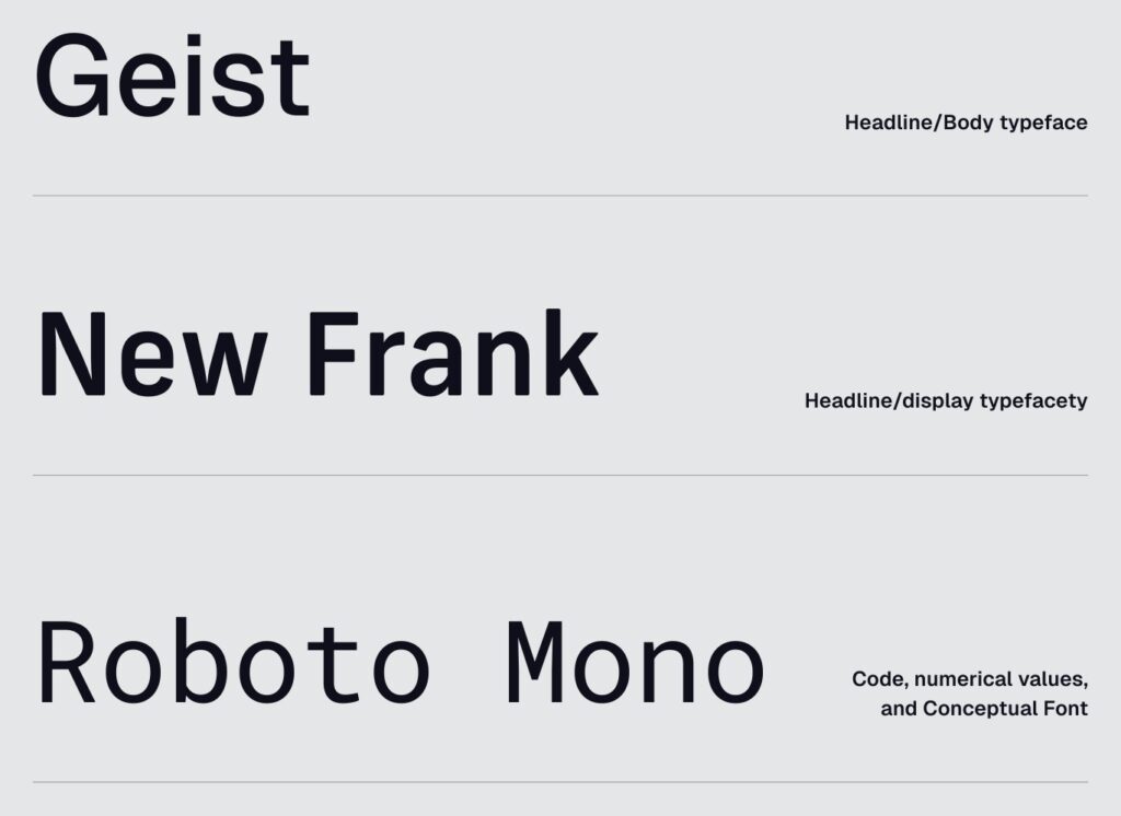
We use three Latin typefaces, each with its own role: Geist as the base, New Frank for headlines, and Roboto Mono for code and numbers.
Geist: The Base Typeface
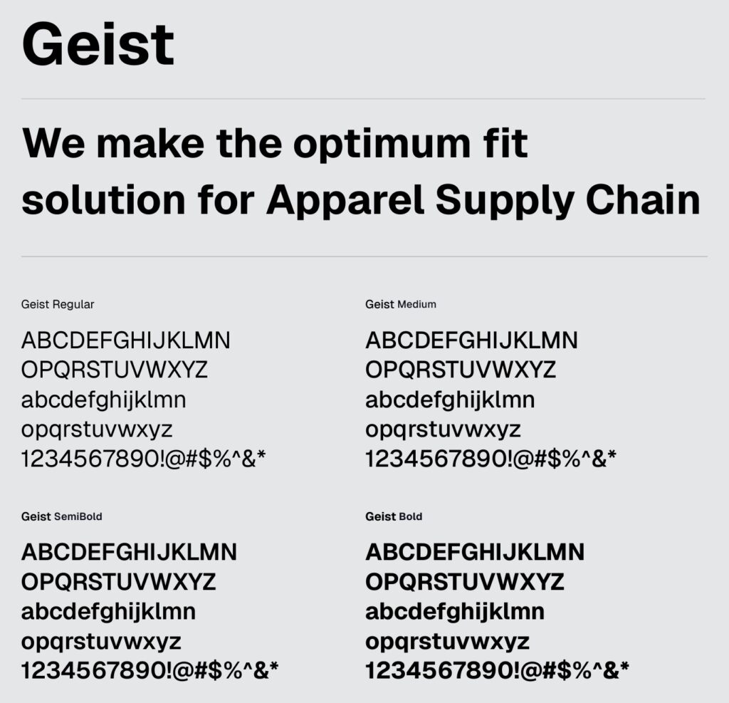
Geist is SIJE’s most basic typeface, used for everything from body text to headlines and captions. Regular is for body text, Medium for light emphasis, and SemiBold and Bold for strong emphasis.
New Frank: The Headline Typeface
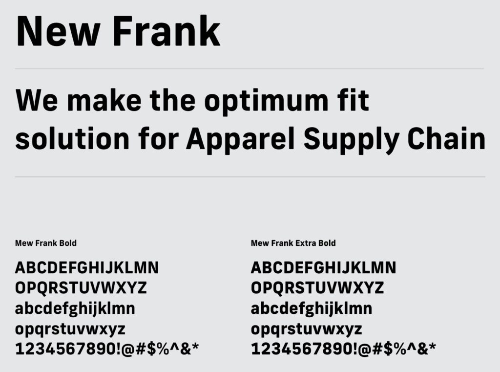
This is our headline and display typeface. Bold is used where the brand needs a strong presence, such as emphasized text or block quotes, and Extra Bold for the strongest emphasis.
Roboto Mono: Code and Numbers
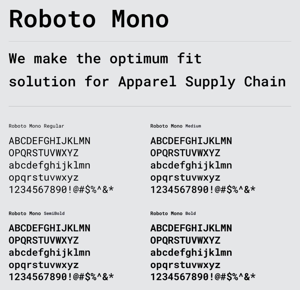
A supporting typeface for functional and quantitative content such as code and numbers. In Part 1, we explained that the logo takes its motif from code; Roboto Mono carries that code mood into text. Regular, Medium, SemiBold and Bold are the four standard weights.
Acumin Variable Concept: For Subsidiary Logos Only
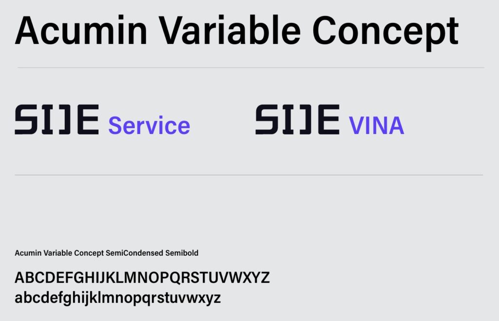
A dedicated typeface used only when a service or region name appears with the logo. Only SemiCondensed Semibold is used, and in the horizontal combination the name keeps 60% of the wordmark’s height. Service names capitalize only the first letter (Service), while region and factory names use all capitals (VINA). It is narrower than Acumin Pro, which is used for the slogan, so the two should not be mixed up.
Korean and Other Languages

For Korean, we use Pretendard, for both headlines and body text, choosing the weight for the situation: Light or lighter for supporting text that needs a soft tone, and ExtraBold or Black for large headlines and high-impact messages.
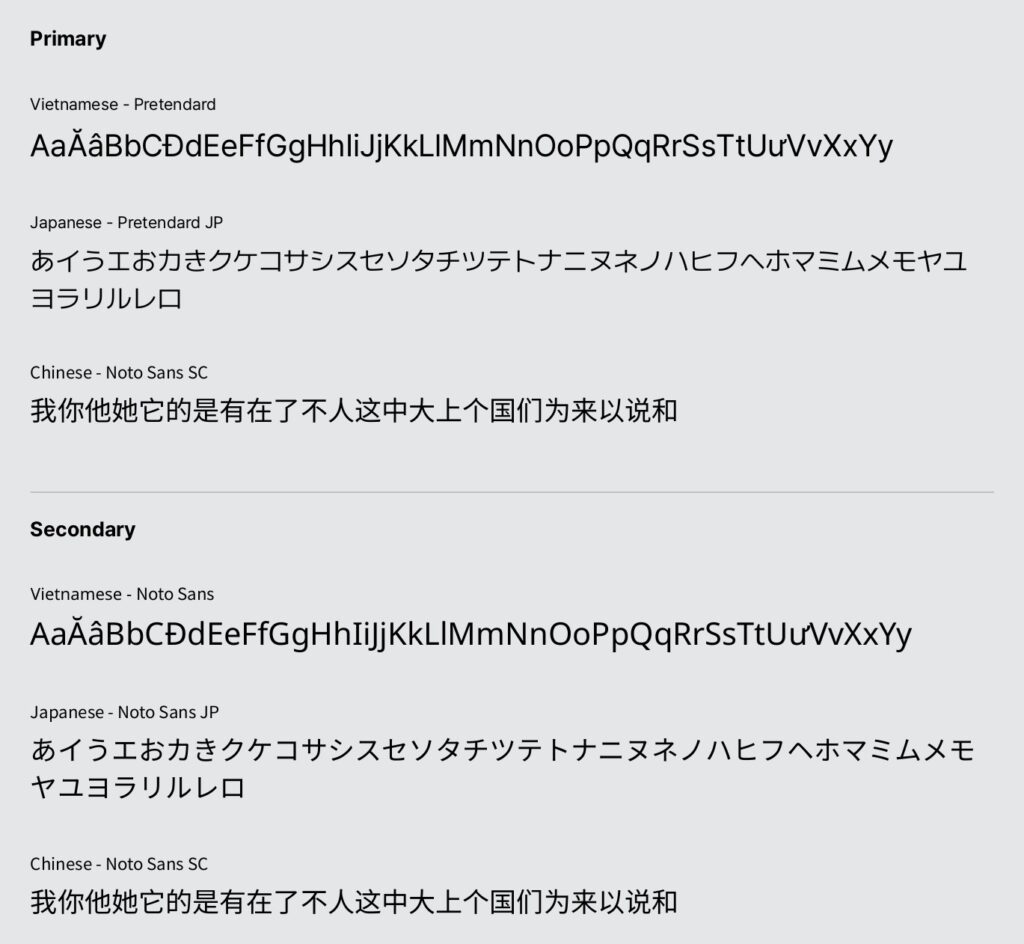
Because Monolis is used in factories across several countries, we also set standards for other languages. They come from the same concerns we described in UX Note (2) about global UX writing.
- Primary: Pretendard for Vietnamese, Pretendard JP for Japanese, Noto Sans SC for Chinese
- Secondary: Noto Sans, Noto Sans JP and Noto Sans SC where the primary fonts can’t be used
When a document is opened or edited on a computer without our main fonts, Arial takes their place. That’s why editable source files sent outside the company are made in Arial from the start, so fonts don’t fall back to a default. PDFs can keep the main fonts.
Typographic Hierarchy
Once the typefaces are set, we also need to decide which weight goes where. This is the basic hierarchy in the guideline.
| Role | English | Korean |
|---|---|---|
| Headline | New Frank Bold | Pretendard Bold |
| Sub-headline | Geist SemiBold | Pretendard SemiBold |
| Body Text | Geist Regular / Light | Pretendard Regular / Light |
| Sub Display | Roboto Mono Bold / Medium | Not specified |
| Caption | Geist Regular / Bold / SemiBold | Pretendard Regular / Bold / SemiBold |
Typographic hierarchy for English and Korean materials (source: 2026 SIJE CI Guideline)
To highlight specific words in a sentence, we use color rather than weight. Which colors to use on each background is covered in the highlight rules in Part 2.
Graphic Motifs: Brackets and Dots
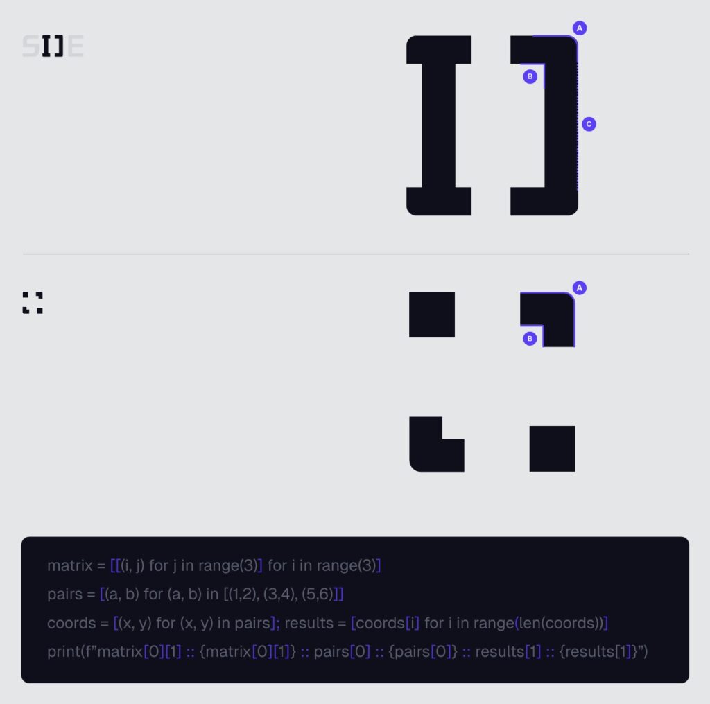
Our graphic motifs start from code symbols. The square brackets formed by the I and J of the wordmark, and the corner dots of the symbol, become graphic elements on their own.
- Square Bracket Frame: brackets hold many variables, and the solution changes with them. Outer corners are rounded (8px), inner corners stay straight, and the middle line can extend as needed.
- Corner Dot Frame: a frame that simplifies the symbol’s four dots into pixels. The same rule applies: 8px outer corners, straight inner corners.
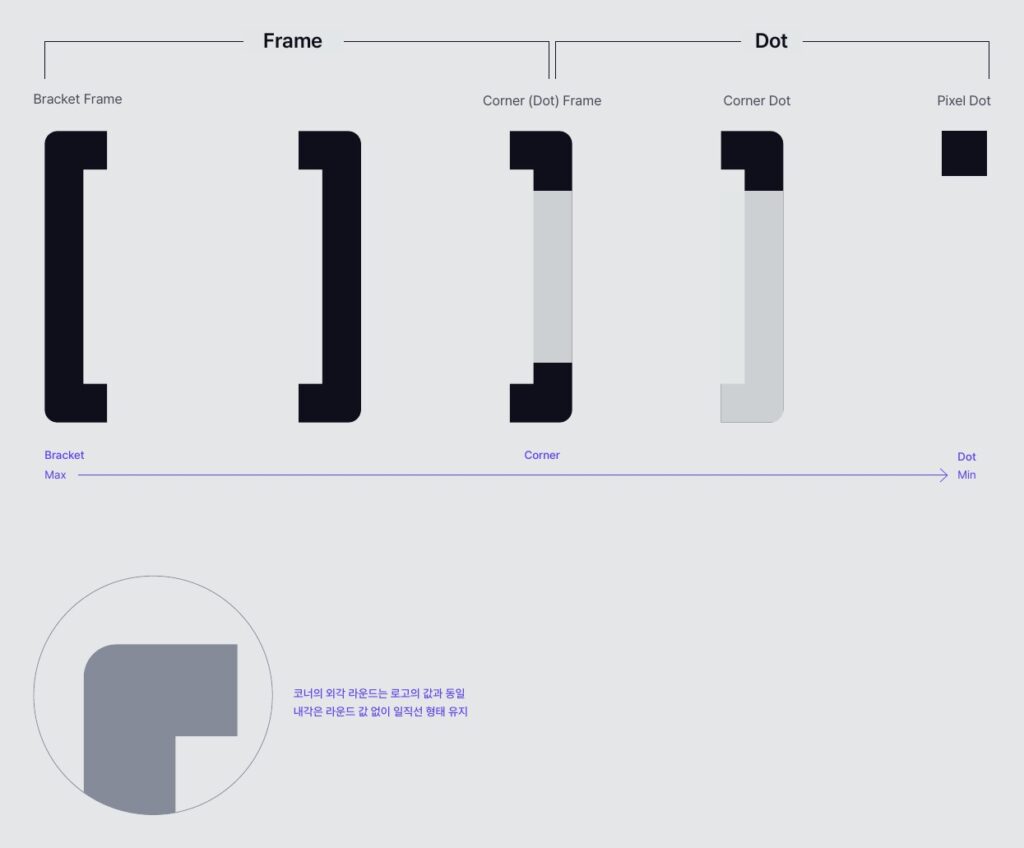
These elements can be reduced step by step: from Bracket Frame to Corner (Dot) Frame, then Corner Dot and, at the smallest, Pixel Dot. The outer corner round matches the logo, and the inner corners stay straight with no round.
Type A: Bracket Frame
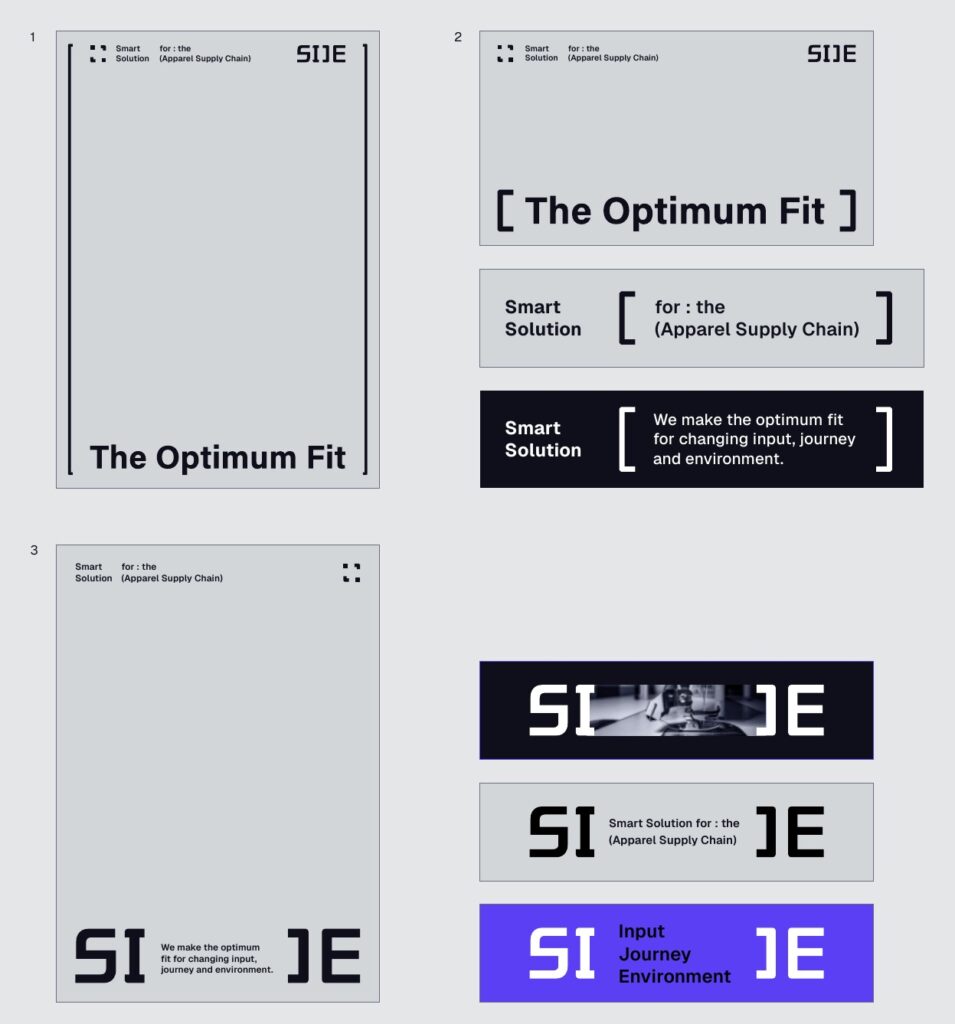
- Full Frame: brackets wrap the whole canvas, holding the logo, slogan and message together.
- Text Highlight: brackets wrap a sentence or keyword to emphasize it. The number of text lines can follow the bracket height.
- Logo Variation: the wordmark’s brackets expand into an independent graphic. The space between “SI” and “JE” adjusts to the content and can hold images as well as text.
Type B: Corner Frame and Dots
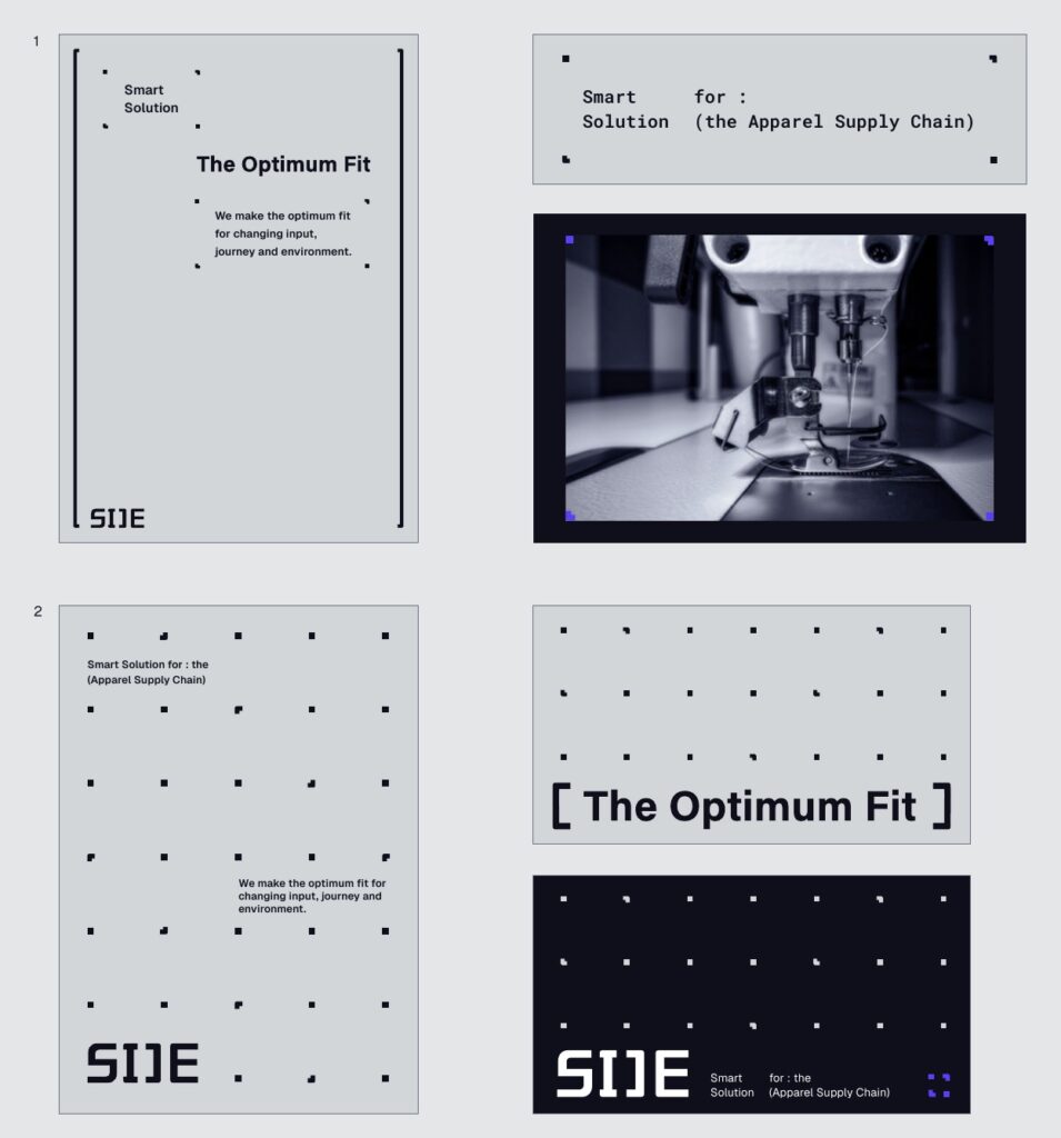
- Corner Frame: the dot graphic of four pixels and frames is the basic unit for grouping text. The spacing between frames can widen as needed, and it can hold images instead of text.
- Dot Pattern: scaled down and repeated, it becomes a dot pattern. Text, logos and symbols can sit inside it, but they must not overlap or crowd the dots.
Pixel Dot Pattern
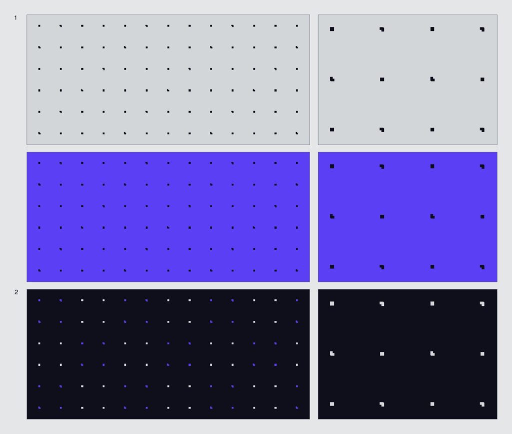
SIJE’s dot pattern combines square pixels with corner-frame pixels. It is never used outside the defined background and color combinations.
- Mono Type: Terminal Black dots only, on Grid Gray or Vector Purple backgrounds.
- Dual Type: Grid Gray dots as the base on Terminal Black, with Vector Purple dots as accents only. Purple dots are never used alone.
- Both types come in Dense (fine texture for backgrounds) and Wide (larger spacing that emphasizes individual dots and can act as a corner frame).
Extended Elements and Icons
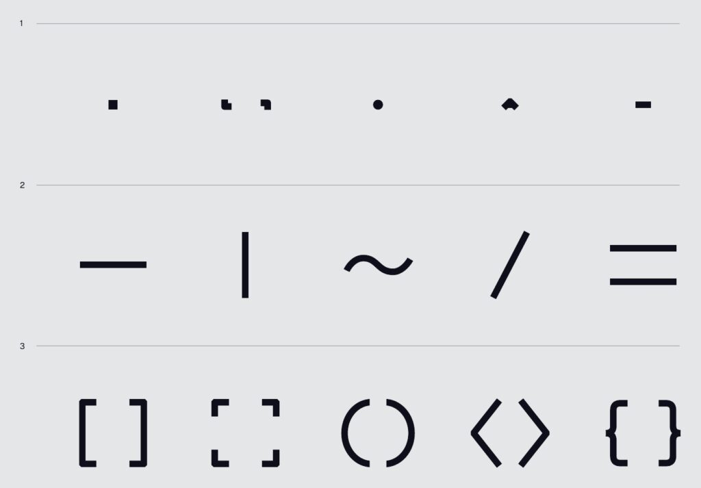
There is also a smaller graphic vocabulary: Micro Elements made of dots and signs, Line Elements that express connection, separation and flow, and Bracket Elements that mark areas of information and their relationships. Each can be used alone and forms the basis for icons and patterns.
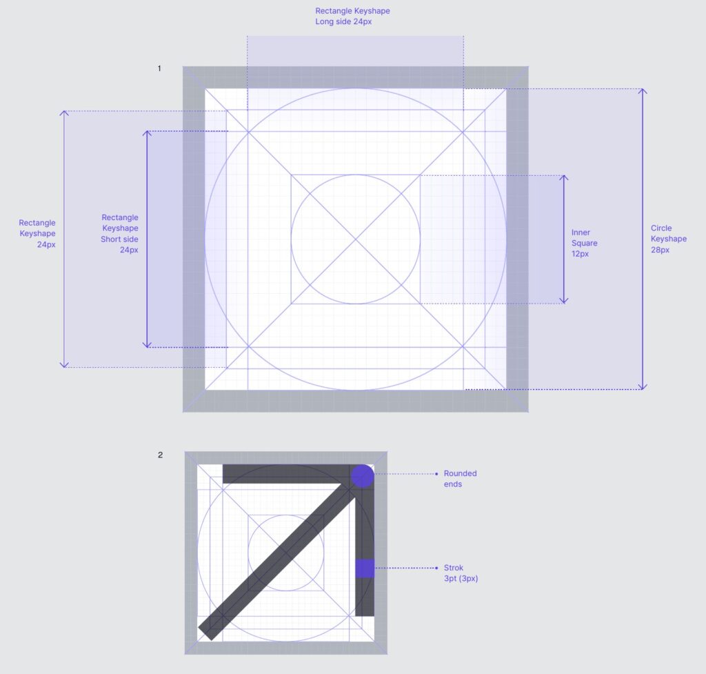
Every icon is drawn on the same grid, with a 3pt/3px stroke (at 32px) and a 1px corner round.
Putting It All Together
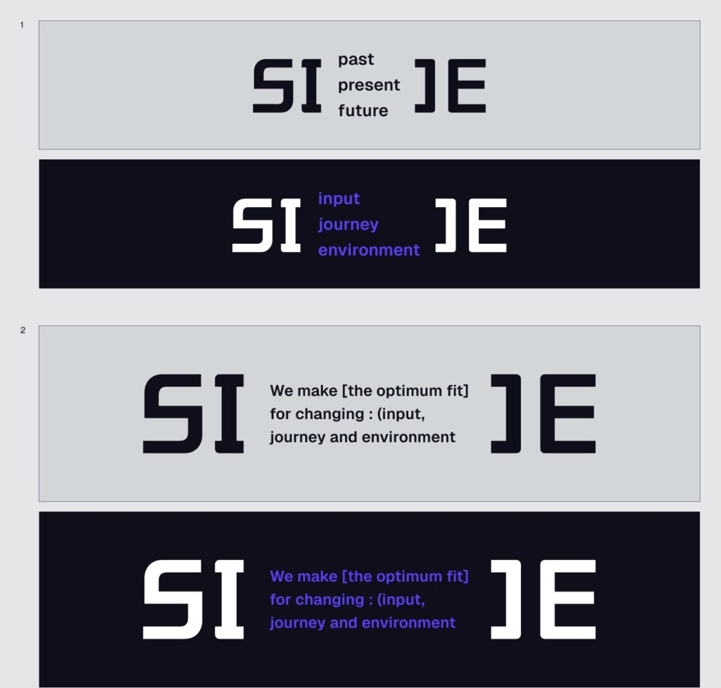
Type and graphics come together in the key visual. Type A stretches the wordmark’s brackets horizontally and fills them with keywords such as past, present and future, or with a SIJE sentence.

Covers and supporting graphics for communication are built from the same elements. They are composed so that brackets, corner dots and a short line in Roboto Mono are enough to tell that a piece of material comes from SIJE.
Wrapping Up
Across Parts 1 to 3, we walked through the logo, colors, and type and graphics. We set rules for every element so that SIJE looks like SIJE no matter who makes the material.
As the guideline’s introduction says, the goal is for everyone to express the brand by the same standards in their own work and projects. We’ll keep refining these rules so that even teammates who aren’t designers can create proposals and slides that feel like SIJE.
