


SIJE CI Renewal Story (1): Finding Our Essence
As a company grows, it inevitably encounters moments of transition.
When a product finds its place in the market.
When an organization begins to scale.
And when it sets its sights on a new vision for the future.
SIJE is standing at one of those turning points now.
And at this moment, we’re introducing a new logo.
Changing a logo wasn’t simply about refreshing our appearance.
It required us to ask more fundamental questions:
Who are we, really?
And why do we exist?
This story begins with those questions.
Let us walk you through it.
Changing the Logo?
It Was Really About Redefining Ourselves
“What kind of company is SIJE?”
That question was easy to answer.
“We build solutions for the apparel supply chain.”

But when we asked ourselves,
“Why do we exist?”
“What vision do we hold?”
the answers varied slightly, even internally.
That told us something important:
our identity and message had not yet been clearly defined.
From the beginning, SIJE focused on product performance and technical excellence.
Naturally, discussions around philosophy or core values often took a back seat.
But now, we felt it was time to articulate something beyond technology:
our reason for being, and the value our brand stands for.
The Meaning Behind the Name SIJE
A State That Changes Over Time
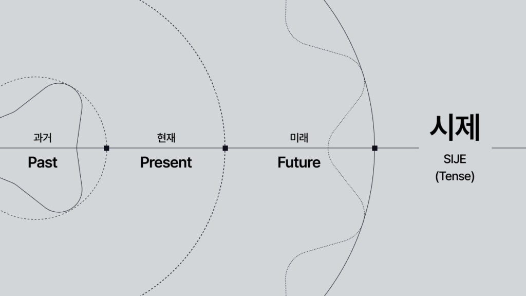
The name SIJE comes from the Korean word “시제(時制)”, meaning tense:
past, present, and future.
It represents a state that changes over time.
Not Just Connection, but Optimization
Just as the apparel industry once created optimal value within the limits of its era,
we aim to define a new flow for the future through digital transformation and technological innovation.
What matters is this:
SIJE is not about simply connecting the past, present, and future.
We redefine what is optimal for each era
and strive to create inflection points in the apparel industry.
The Questions We Faced
Does Our Current CI Truly Represent Us?
As we revisited our existing logo, several doubts emerged:
- Does a chain-shaped symbol of “connection” truly express SIJE’s essence?
- Do our brand colors reflect the image we aspire to project?
- Can this design expand logically and strategically over time?
Four Key Challenges to Solve

- Actively reflect the meaning behind the name SIJE
Make the philosophy embedded in our name visually explicit. - Connect corporate philosophy with design logic
Be able to explain why this form, and why this color. - Move beyond a dull, static image
Maintain trust and weight, while becoming refined and dynamic. - Ensure scalability and flexibility
Build a system that works consistently across media and contexts.
Defining “SIJE-ness”
Who We Are
We are not merely a technology company focused on efficiency.
We understand the essence of the industry and design optimal structures from within it.
Philosophy · Vision · Mission
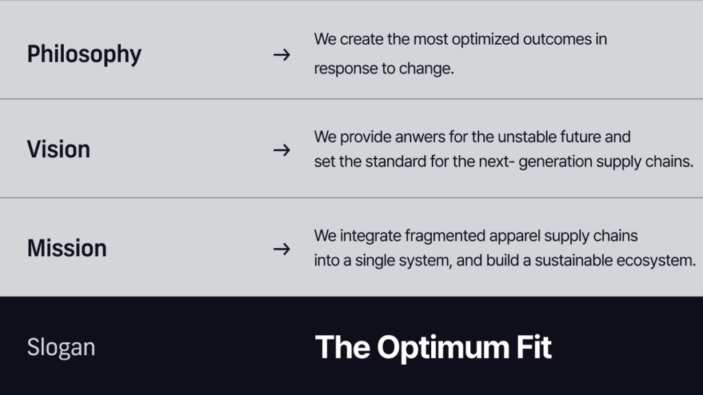
- Philosophy
We create the most optimized outcomes for every change. - Vision
To provide answers for an unstable future of apparel production
and set the standard for next-generation apparel supply chains. - Mission
To integrate fragmented apparel supply chains into a single system
and build a sustainable ecosystem.
One Sentence That Captures It All : “The Optimum Fit.”
This phrase is not just about technical perfection.
It represents a mindset:
finding the most appropriate answer in constantly changing conditions.
It reflects SIJE’s commitment to creating optimized outcomes
at every turning point of an era.
Four Core Values
To carry our philosophy and vision into the way we actually work, we needed standards for how we act. So the first chapter of the guideline also defines four core values.

- Mono · Into the Mono
Making the complex clear and single. We converge into one flow through automation and connection. - Fit · Optimum Fit
The optimal result for each situation. We find the most optimal result for a changing state. - Make · Make it count
Creating meaningful results. Beyond productivity and simple output, we create meaningful value. - Synergy · Driving synergy
The power to grow together. We grow together and create positive synergy.
In the keyword visual, each value is drawn as a single symbol instead of words, the same way the wordmark was built like a formula.
SIJE Formula: Becoming a Single Equation
Wordmark as a Mathematical Expression
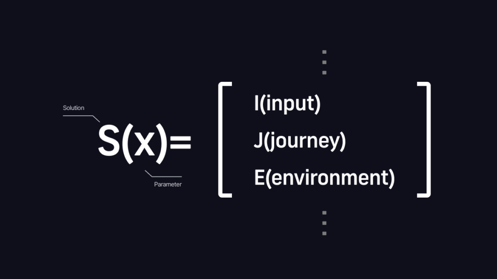
Wordmark Concept: S(t) → S(x) = ?
Our new logo borrows the logic of mathematical formulas,
treating the entire design as a single Formula.
The wordmark is derived from the structure: S(t) → S(x) =
- S = Solution
- I, J = Brackets containing variables (x)
- E = Equals sign (=)
Infinite Possibilities Inside the Brackets
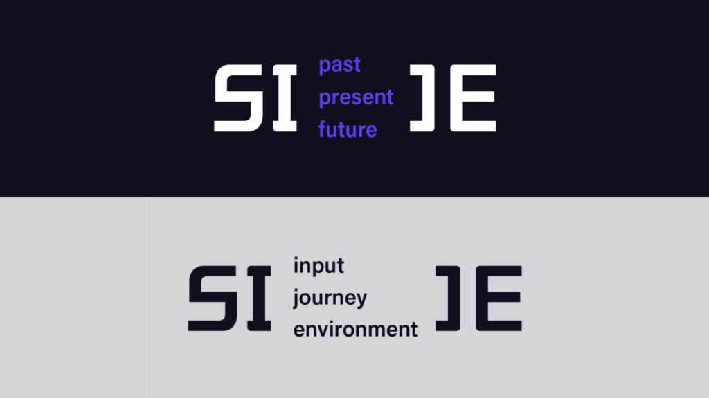
“I” and “J” are designed like brackets,
symbolizing SIJE’s way of thinking: finding optimal solutions under changing conditions.
The space inside the brackets represents infinite variables and possibilities.
Not a fixed answer,
but an ever-evolving formula optimized for each era and environment.

Expanding into the Language of Code
This structural concept extends into SIJE’s overall design language: Code.
Code is the foundational language of IT
and a core keyword of SIJE’s visual identity.

- Contemporary
Refined sophistication with restrained weight - Logical
Calculated, mathematical order - Digital Code
Systems, programming languages, mechanical precision
Symbol: Double Colon (::) and Four Dots

The symbol is composed of a double colon (::) and four dots.
In programming, a double colon signifies the definition of a new structure.
The four dots function as a symbolic code and frame for SIJE’s optimization formula.
Built from pixel-like squares and corner frames,
the symbol is both a standalone sign and a structure designed for infinite expansion.
A Balance Between Logic and Flexibility
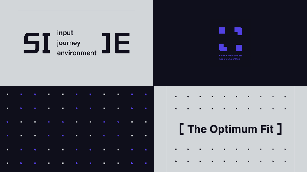
Both the wordmark and symbol use uniform, linear structures to convey a logical, digital image.
At the same time, gentle curves and bold, confident strokes soften the form,
preventing it from feeling too sharp or rigid.
Open spaces and balanced proportions create stability,
resulting in an identity that feels precise yet approachable.
Through these design choices,
we were able to build a brand identity that is distinctly SIJE.
Every Corner Was Calculated
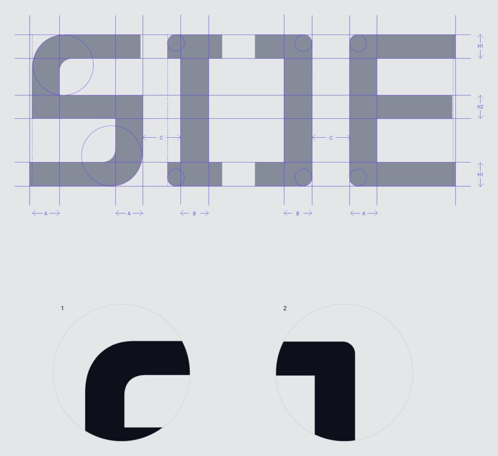
Place the wordmark on its grid and you can see that stroke weights and spacing follow set rules. The part we worked on most was the corners.
- The corner round of “S” starts more gently than those of “I” and “J”. The rounded curve keeps the whole logo from feeling cold or rigid.
- The corner rounds of “I” and “J” are balanced just enough to hold the bracket shape. They read as structural brackets while leaving a flexible impression.
The symbol follows the same principle. The pixel squares and corner frames use different weights and scales to complement each other, and their proportions are tuned so the whole reads as one unified dot.
Rules for Using the Logo
Making sure the logo looks the same everywhere matters as much as designing it. Here are the rules from the guideline that come up most often.
Clear Space and Minimum Size

The logo keeps a protected space where no other graphic or text may enter. This clear space is calculated from the proportions of the wordmark and the symbol, and in practice we recommend leaving even more room. The smallest allowed size is 5mm / 15px.
Logo Color Combinations

- Wordmark: Terminal Black on Grid Gray, Formula White on Terminal Black
- Symbol: Vector Purple on Terminal Black, Terminal Black on Grid Gray
Where color printing isn’t possible or only one color can be printed, use pure Black (K100) or White (K0) only.

On a Vector Purple background, both Terminal Black and Formula White can be used. On images, use Terminal Black over bright images; over dark images, use Formula White for the wordmark and Vector Purple for the symbol. And the wordmark never uses Vector Purple. Purple is allowed only for the symbol.
What Not to Do

The guideline also lists twelve incorrect uses. These are the mistakes we see most often:
- Tilting or rotating the wordmark outside special cases
- Stretching or compressing its proportions
- Combining the wordmark with the symbol
- Adding an arbitrary border
- Placing it on a busy background
- Using it together with a company name such as “SIJE Corporation”
- Placing the wordmark between words in a sentence
- Cropping the wordmark
How to Use the Slogan The Optimum Fit

“The Optimum Fit,” introduced above, is also used as our slogan. The slogan stays in English and is not translated or mixed with other languages, except where there is a legal obligation before registration.
- There are three types: Sentence Type Basic (Acumin Pro Medium), Sentence Type Bold (Acumin Pro Bold), and Bracket Type Bold (Acumin Pro Bold) with square brackets.
- The minimum size is 3mm for Sentence Type and 5mm for Bracket Type.
- For two lines, break after “The”; for three lines, break after each word. Bracket Type is used on one line only.
- The three words are never split, never reordered, and always set in the same font size and color.

Using different colors for the wordmark and slogan, changing the size of individual words, or breaking the bracket slogan across lines is not allowed. A multi-line slogan is always left-aligned, never centered.
▶️ What’s Next
In Part 1, we explored why we began our rebranding journey
and how our philosophy was translated into design.
In Part 2, we’ll share the story behind our color strategy:
why we moved beyond navy to embrace neutrals and purple,
and how our team came together to complete the new CI.
If you’re curious about how we plan to expand these changes,
read Part 2.
